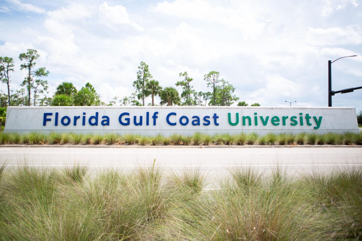
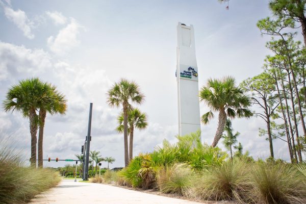
FGCU has been rebranding around campus. Changes to the front entrance sign and the new FGCU sign on the library lawn have been made to address the logo change made in 2022.
FGCU is establishing this change to improve the outlook around campus. These modifications have not come without controversy, as the student body is split on whether they are for or against the new signs and logo.
“I wish they had kept the previous font, I think it looked a lot better and suiting to our university,” junior Camila Gonzales said.
FGCU conducted significant changes in its rebranding movement by redesigning the pillar and signage monuments at the main entrance. These changes involved a font change to the concrete signage and a logo change to the pillar.
On Monday, Sept. 25, FGCU unveiled their second major rebranding structure on the library lawn. This new photo-spot is located in front of the lake by The Water School.
Many students have stated their positives and negatives on the new signage, but some initially did not notice that changes were made to the campus.
“I like the sign that is more out in the open, I did like that, but if there was a sign that was closer to a front entrance or something, I haven’t even seen that yet. So, maybe it’s just a bad spot to put it,” sophomore Declan Bowdren said.
In a document discussing the carryforward funds for FGCU, the FGCU Board of Trustees describes what each portion of the funds will be used for. One of those budgets is geared towards the university rebrand.
As stated in the agenda from the Board of Trustees meeting on June 14, 2022, “The university continues to market the Idea to Impact campaign and formulate a new logo. This investment supports branding the campus as well as making changes required to signage, letterhead, etc. that will be needed with a new logo.”
Funds for the rebranding were put towards the new signage and logo changes around campus, totaling $1,040,000, as well as a small portion being left over for the journalism department. Many students feel it could have been used for other improvements around campus.
“If it’s the school money, it could have been put toward scholarships or something… it’s nice but not necessary,” Bowdren said. “If they are willing to put up a sign out of nowhere, they should be able to help with our tuition.”
The controversy is not only seen by students, but from parents and FGCU alumni. This is exemplified through FGCU’s two Instagram posts regarding the signage. Many of those comments discuss where people think the money should have gone instead.
“Gotta love that my tuition money is going towards a giant FGCU sign instead of more parking spots,” one comment said.
“The old logo was much more formal. This feels like a silly representation of our school, but whatever you want to do FGCU,” another comment said.
Pamela McCabe, Coordinator of University Communication and Media Relations, provided some insight into the reasons FGCU made these changes.
“State law dictates how a university can use funding sources to cover expenditures. The installation of the FGCU letters on the Library Lawn, among other marketing initiatives, were paid for with carryforward funds, which are funds that are moved from one year’s budget to a subsequent year,” McCabe said. “Expenses like the construction of a new parking spaces and employee raises are supported by other revenue streams. To be clear, the money used to install, create or update the logo around campus were not covered by student tuition, student fees or funding sources that could have been used for employee raises.”
For two years, FGCU had the funds put aside for a rebrand with initial talks starting in July 2021 about the development of a new logo. A poll involving three logo options came out for student vote later that year about the logo. The President’s Cabinet later selected the logo with the highest number of votes.
FGCU felt it was time to make a change more fit for the “digital-first world.”
“The new logo is almost a year old, and implementing the new logo and branding guidelines across campus is an ongoing effort,” said McCabe. “During the summer, we updated campus with more than 1,100 signs, including way-finding or directional signs as well as hundreds of vinyl logo designs you see on office doors and windows. We also updated the main signs at the main entrances to campus, including the odalisque, and added in the FGCU letters to the library lawn this term.”


